BRAINSTORMING

Originally I planned on making a sci-fi film. Something that I can draw interesting backgrounds for. I struggled with coming up with a good enough story, and when I did I found it very bland and cliche. I loved watching Akira and Nausicca, however if I had to come up with some big life changing story on my own I didn't find it as appealing... So going back through some of my favourite old works (i.e. 10x10s) I found that I tend to work better with small plots. Something simple so I won't overthink it. So I stayed in the flat for a day, shutting out all the distractions and decided to come up with things that've happened to either me or people I know which could be used as a story.

The idea that appealed to me the most came from me thinking back to my childhood shenanigans and my lift encounters as a child, where I got my hand caught in the lift doors and dropped a toy between the lift gap on separate occasions. 

The Idea
The story revolves around a security guard stumbling across a child who dropped their toy down the elevator shaft. Seeing this the security guard remembers a time when they were young and lost their toy. He might not have dropped his toy down the elevator gap but the security guard has lost something in a similar fashion in the past. The story itself is quite simple, however I wanted to build the characters relationship through this flashback to hint a parallel story between the two characters.

Aesthetically, I looked at films and illustrations that gave off a nostalgic feel and reminded me of my home Hong Kong. While brainstorming I came back to this film that I loved called The Remedy 健憶舒心茶 by Zilai FengIt is possible I was drawn to this film because I connected with the culture behind the film. The visual aspects of the film got me feeling really nostalgic as well. But it was a good starting point. Here are some other things I looked that had a really good vibe to it: 


Some of the things from the board above doesn't follow the same themes but stood out to me the most. Mob Psycho 100 has a really loose style and saturated colours that I found very uplifting. I am also a big fan of the anime itself so I had to include this into my moodboard. During my research I came across this short called Tough by Jennifer Zheng. I love the colours and transitions in the film. The story itself was quite bittersweet but I found the story and the visual placements in the shots very inspiring.


For the flashback sequence I looked for something similar but quite different. Having this parallel storyline allows me to change the palette to my film, as though I am working on two films rather than one. I didn't want the flashback to be bleak so I decided to look into colourful works that would also remind the the audience the scene before them is a memory/a scene that doesn't go chronologically with the main storyline.


Here's a link to my pinterest board for some extra inspo:


Storyboard
While researching I slowly came up with a rough story where a boy drops his toy down the elevator gap and a security guard tries to retrieve it back for him when he sees the scene. Here is a storyboard I sketched up: 


It starts with the boy trying to open this new toy (a gatchapon toy to be specific in this draft) he got while waiting for the lift to arrive but accidentally drops it down the lift gap as he enters the lift. We see him dropping the contents down the lift gap and him trying to reach down to look for what's lost. The story revolves around gatchapon toys and the security guard feels nostalgic seeing the scene and decides to help the child retrieve the toy back.

I wanted to use the gatchapon toy in this film because it was something I loved doing as a child and I really wanted to show it to the audience. But I don't know if everyone viewing the film would understand the significance of the gatchapon machines. So I might have to op that idea out and use a simpler toy design.

For the pitch I made a new opening sequence, in the first storyboard the security guard is at their desk and sees the child at the lobby. In this version the security guard sees all this unfold from his security cameras and runs to the lift to stop the kid from reaching down:


In the original version I have another storyline going on where you see the boy and his guardian with him when he drops the toy. He is forced to leave the scene quickly while the security guard sees this. The film pans out in the timeframe of a couple days. For this new one I've cut down all the other elements and stuck with the basic premise of the story.

FLASHBACK SEQUENCE

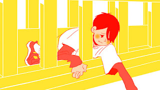
I wanted to be able to visualise my film more. In order to do this, I must have a visual understanding of the two storylines within my film. With that in mind I did a couple colour tests on a mock up sketch of the flashback: 


I started by doing tests with coloured outlines. This started out being inspired by 'Summer Wars' with all the scenes in the digital world being drawn with a red outline. However when ScotlandlovesAnime showed 'Night is Short, Walk on Girl' by Science Saru I instantly feel in love with some of the simplistic yet colourful shots in the film. So I did a couple shots without too much a character outline. I wanted the flashback to stand out. When the audience see it I want them to know isn't part of the present scenes visually.


To bring this into my character I did some tests with a character sketch I did quickly.  Rather than lining it as it is I outlined the character with block colours to create  silhouettes. I could also look into just using one colour for the flash backs which means I have to figure out how to use negative space- that could be very interest as well. The blue example might be the closest example of it. Using just neon blue for the whole film, with the main character wearing a yellow jumper maybe so the character can stand out of the background even more. 

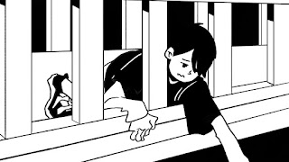
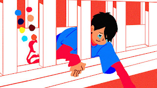
While I was working out how the character might look I did a possible mock up of a shot from the flashback scene. The drawing is a little further away than I want it but it gives me a chance of drawing the bridge as a whole. Here are some test designs I did:


This was one of the first tests I did, I actually really like the way it incorporates screentones. But would it get distracting when animated on? Would the blue and red also seems a little too strong for a flashback? This was my first test, so I continued tweaking the colour palette a bit.


I just tried the black and white look of of spite, I feel like it's a little bland. I wanted the flashback to have a nostalgic vibe to it so I wanted to use colours that you can find in children toys/ gives off Chungking Express vibes to it.
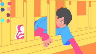
The last two tests I drew the characters without an outline. I actually like the look of it but the background suddenly had too much detail. So I went on to simplify the background even further with this: 


To give the overall look a bit more texture I put on a noise filter so it looks like something from an old cartoon. I'm still a little skeptical on the colours and the look so I might continue tweaking it. It seems quite difficult and extravagant to animate so I'm going to test it out a bit more and see where I can simplify it.

INITIAL CHARACTER DESIGNS


Some initial character design I did for my characters in the film. I scanned in some of the sketches I did onto my computer and tried colouring some of it. At times I feel as though I'm not making my characters young enough but I don't want to make the characters too squishy so I going to try softening some of the features.


I've also been referencing Tekkonkinkreet's characters as the film has a very strong style  seen in all the characters- kids and adults. That being said, the audience can still differentiate the characters through the composition of the character's face, outfit and choice of colour. For instance, Shiro in Tekkonkinkreet is shown to be the younger brother through his choice of clothing and colour scheme which reflects his naive and child-like persona.


After sketching I decided to test out drawing the characters digitally in order to familiarise myself with drawing a couple designs that I really like. Printed tops on characters are really cute, however its difficult to animate all this detail.

Someone commented during the pitch that it might be a good idea to make the security guard older, as older characters tend to get nostalgic which would fit the flashback idea quite well. Which became quite a challenge to me as I found some difficulties drawing older characters. Even when I'm doodling, the oldest characters I draw tend to be around their 20s or 30s. So I started looking at different ways to portray my characters age without changing the style I draw in too much for easier animation. 


INITIAL BACKGROUNDS


I did a couple mock ups of the background for the pitches we did very quickly with a pencil sketch photographed by my iphone and then coloured in photoshop. By playing around with the saturation I quickly got a mock up of a couple colour schemes. 


After the pitches I decided to do a more detailed mock up digitally instead. However, not even half way through the drawing I stopped. The visual didn't seem right. It's still under development but the lines were too clean so I decided to take a break from it and return to it another time. I then compared my mock ups to this digital drawing and realised I liked the rough pencil sketches more, even though I spent less time on those in comparison. The mock ups were really rough and quick, but there's something about it that fit the look I'm going for. 


STORYBOARD REVISITED


After some research and brainstorming I went back to my storyboard to make changes. Here is a very short version I did that just includes the basic opening shot & flashback, no ending or development for one of the pitches:


In the beginning there is an awkward transition between the child's point of view in the opening of the film and switching it to the security guard after. So I opted for a scenario where the films starts off with the security guard and ends with the security guard's point of view. The shots in this is quite similar to the final version, but I decided not to show the security guards face until he meets the child to build tension in the beginning.

This is the current shot list, I have tweaked a bit of the shots but most of them are shown here:


My aim is to finish animating by our hand-in deadline and colour after, however I'm trying to prioritise my shots so the story is clear and the different sections in the film is clear.

Film Flow
While working on my film I categorised each part of my film with the opening act (which where it's mostly setting up the set and slowly revealing the main characters, the meeting where the two characters interact, the flashback sequence where the audience see a younger security guard reach out but fail to retrieve his toy. Finally, the final stretch where the security guard tries his hardest to do what he couldn't in the past.

After establishing the shot list I can start organising the shots. I have all the shots lined up and grouped together into different Photoshop files, however there are times where the film loses its momentum in the rough shots. I have started playing around & rearranging some of the shots to make the story more fleshed out and improve on the flow of the film.

In the rough animation each shot isn't timed correctly,  some run faster than I prefer, but after animation the movements will be much longer. Currently my rough animatic is currently 1 to 2 minutes long. The rough animating gives me a starting frame to work on and a overview on all the scenes I need to work on. 

All the updates have been included in the shot list above (via post its/ included digitally)

Opening Act 

From this storyboard I changed the opening shot drastically, after some consideration I realised the rough story I had in the beginning included an awkward perspective change between the two main characters, starting the story from the child's perspective and then shifting it towards the security guards. It made more sense to follow one character perspective rather than two. The film's storyline will also slowly unravel smoothly if we have the security guard discover the scene of the accident (where the boy drops the toy) during his rounds. With the flashback scene later on and the main emotional storyline based on security guard, it made sense to follow his perspective. It also gives us a chance to shape the younger character more with the way they react to the situation through the eyes of another. 

Once this was decided the tone of the opening scene also changed. As this guard is rooming the halls of this old apartment building a more ominous feel can be created.At that very moment we came up with that idea this scene from a short called 'S T E P S' by Alex Avagimian popped into my head:


The short has a mysterious feel to it, leaving the audience questioning what it all leads up to until the reveal in the end (Edit: sadly the video has been taken down. I only have a screencap of those two shots but the animators blog is here https://alexavagimian.tumblr.com for reference). I think this sort of vibe will work well as an opening to my film. As the film is dealing with quite a light topic in comparison the change of tone in the film could make the story more interesting. This also gives me a chance to draw detailed backgrounds and allow the audience a really get a feel of the set in the beginning. I also wanted to set a contrast between the colours in the lift and the hallway. Where the hallway is badly lit and quite grim the lift is more luminous with warmer tones of colours in comparison.


Flashback 
The flashback is triggered when the security guard sees the situation the child is in and this resulted in the two characters bonding for a moment over losing a toy. Originally, the flashback was going to show a younger security guard losing a toy in school, forgotten or misplaced only to realise it was gone later on, resulting in a longer flashback storyline. However, after some brainstorming I didn't know if just the act of losing a toy is strong enough to leave an impression & form a connection in the audience's mind, so I decided to  be more specific with the situation. In my film the young boy drops his toy down an elevator gap. What stood out from this situation was the physical act of having to reach vertically down a small gap, the child's inability to reach for it and the set of the lift (unstable/ could be called away in any moment).

I didn't want the flashback to be a complete parallel to the current storyline, as long as the security guard is shown to be struggling and reaching in a similar manner to the boy would be fine. Somewhere like a river, a ditch etc. This also gives me room to play around with interesting animation sequences.

There is a couple moments in the film Spirited Away where Chihiro (the main character) remembered that she dropped a shoe down a river when she was younger. I used this shot as a reference point & went back to study it a lot which resulted in me following Alan's suggestion of setting the flashback over a river where the security guard would watch as his toy floats away while he's trying to reach for it from a bridge above:


I also liked how they used sound and touch as the main ways of perception to trigger that memory. I also looked at this video that talks about different flashbacks: https://vimeo.com/99139322 I really enjoyed the example they used where the flashback is hinted through the sound effects & you could tell it was a memory with the way the sound was presented and the characters reaction to the situation. Sound design and music will probably play a bigger role in the flashback sequence in comparison to the other parts of my film. I really want to incorporate the water sound effect every time the security guard thinks back since the five senses plays a key roll in triggering memories. I will have to talk to my sound designer in the future to sort this section out.

FLASHBACK ANIMATION VISUALS
For the flashback sequence of my film I wanted to make it quite dreamy and through smooth transitions. Something like this 10x10x17 I did last year (the last bit): https://vimeo.com/204256347. As I've set the flashback set over a river I can use the water current as the main selling point of my flashback animation. An extreme version of morphing would be Masanobu Hiraoka's work. They did the credits for an animation called Little Witch Academia. I don't think that's how I would want my transition to look like but something smooth like that would be cool.

Here is a mock up of how I think the transition would go, its a little cheesy as a shot but the characters tear will drop and morph into the flashback. I'm pretty sure it's been used before but I wanted to make the movement quite fluid and interesting so the water animation will be very important here:
Here is a rough animation I did by hand, just to test out the tear drop pattern. I continued the shot in photoshop after getting the first couple drawings in to test out how I wanted it to look:


The Set & the Characters 
All these events leads up to the security guard finally retrieving the toy. After some considerations with my tutor we both though the build up is important. From the beginning of the film I have already established the three key characters of this film and that is the Security guard, the child and the setting. The ending will use all these elements & see how they interact together.


I established before there's a climax scene where I start bringing in all the different components introduced to the film, however one of the issues I had was keeping the characters roles established throughout the film. From the introduction and the flashback it is established that the audience is exploring the mind of the security guard, and the child is the catalyst. However, during the climax sequence when I try to introduce the idea of the child being scared by the situation and the surrounding this focus began to shifted which changed the tone of the story when it shouldn't have been the case.

FINAL CHARACTER DESIGNS

When it comes to my characters the key points to my character's design is drawing on reflex. With so many frames to draw, if I can't draw the character's features I'm doomed. 

I tried to age him up by giving him more smile lines and a more structured face.He still looks a little young, but you can tell he's at least in his 30s or 40s, hopefully.


For the child I opted for the mob design i did initially. I have tried other designs but I just like this one best. The hair is a lot easier to draw as well, this will make animating him a lot easier (as easy as hair animation goes).

The Toy
The bus/ toy in the film is actually based on Hong Kong mini buses, which is a transport I take quite frequently around where I live. Although the design is a little different to buses it looks pretty straight forward. The toy actually exist, it's technically pocket sized but I made it a little bigger and simplified the design a little:


When I was brainstorming what toy to use I made sure it had to be something bulky enough to be stuck down an elevator shaft and durable so that it's not completely damaged by the time they retrieve it. 
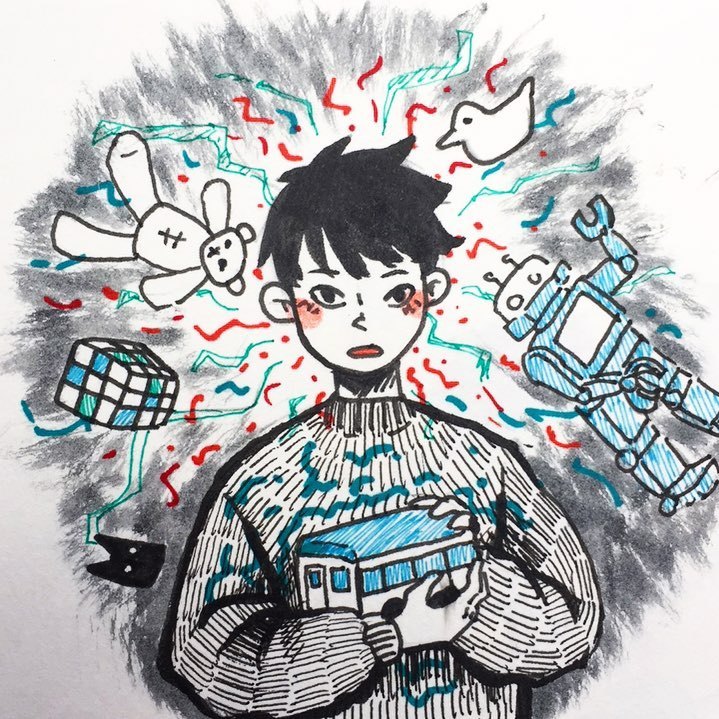
mixed vibes abt what’s going on #inktober #inktober2017 .

This was an inktober I that persuaded me to use the toy bus. There were other choices such as the rubix's cube, a toy bird etc. But I wanted something quite personal. As a big fan of toy cars when I was young I decided to use the buses/ cars for the main prop.

One thing I need to figure out is whether the toy in the flashback and the toy in the present day should be the same. it makes sense for it to be a little different so the audience know it's not the same timeframe or the same toy. It will still be a vehicle or transport of sorts just to keep the situation quite similar. 


Colouring
Security guard uniforms are mostly grey, black or blue. I ended up using the blue just so there's a pot of colour to my character but crisp black slacks and white shirts makes it easier for me to colour. The security guards skin tone is a bit tan, as I wanted have this contrasting colour theme going on and the orange tone pared well with the blue.


For the child I used brighter colours to contrast the more bland colours on the older character. The reds to contrast nicely to the blue tones of the film. It also links in with the lift well. I wanted the child and the lift to stand out because it's the vocal point of the film, there is an unrealistic element to it that I quite like, as it ties into the flashback sequence well.  


All the characters are coloured using bucket tool & touch up on a regular brush for the edges, which makes it an easy process to follow. There will also be a layer of shadow that follows the character which needs to be animated with the movement. They are mostly under the hairline, cuffs of the jacket/ where the light hits.

Most of the character colours I've already decided during pre-production. Once I settled with the background colours I tweaked the characters to work around that palette.

FINAL BACKGROUNDS
After the initial backgrounds I decided to sketching out a couple more detailed ones for a few shots I had in mind. One background takes about one day to do, sometimes faster if I don't get distracted. Here are some backgrounds I drew out, I decided to use these shots in the opening sequence of my film to set a very distinct atmosphere for the audience. 


I ended up using the sketches as the line art in the background because I will lose a lot of that detail if I redraw them digitally. One of the things that convinced me to do detailed background sketches is the work by Shinji Kimura. I have talked about Tekkonkinkreet previously however I particularly like of his background designs. Here are some examples:


Here is a coloured example from another film he worked on Blue Exorcist the movie, I honestly adore his work so much. My drawings aren't as detailed and I still have a lot of work to do colouring wise, but but looking at his backgrounds inspire me so much:
A preview :)

had this shot coloured combining two of the initial drawing colour schemes I liked. I tried to keep the blend layers to a minimum but I ended up using a lot of layering to get some interesting lighting shots. I played around with lighting a bit too much here. Since it needs to be animated I don't want to include too much character shadow to make the colouring process more complex.


It's still a work in progress, however I really like how the blue compliment my character's outfit so I think I have a overall base colour I can work my palette around. This will make it easier for coming up with colours for the lift scenes as well.

Final background colours:


I wanted to set a contrast between the colours in the lift and the hallway. Where the hallway is badly lit and quite grim the lift is more luminous with warmer tones of colours in comparison. With this glowing surreal yellow tone it contrast the blue in the hallway. For the close up shots those backgrounds will be drawn digitally with a pencil brush to imitate the hand drawn look.

The reason I choose to use the overall green tones is because it was inspired by the green that is quite promenade on the streets of Hong Kong/ old buildings:


620971_10151144605119257_672164801_o.jpg (1359×2048) Pottinger Street, Hong Kong

I ended up using the shadows just to give my walls something extra as some walls seem very bare compared to others, but not enough to create directional lighting that might complicate colouring later on.

SOUND DESIGN & MUSIC

For music I'm looking for something muted and simple that the audience can use to reference the flashback every time they hear it. My composer asked me for some examples of the sound I'm thinking of and the closest examples I can think of for the sound design would be the film A Silence Voice. This scene stood out to me not just because of what was happening but the way they muted the sound effects and had the music coming in as well. For music I also referenced Yuki Hayashi's work in the anime Welcome to the Ballroom (click here for a listen). From our conversations they knew what I was looking for straight away. I have sent them my storyboard, however I'm want to have a clear animatic so they have something to work with. The annoying bit is my animatics aren't normally correctly timed, which means I need fully animated shots so my composer have something to work with.

The most important sequence for the music is the flashback sequence. I am actually struggling with the beginning of the flashback. I have the water ripples set but the bubble/pattern in the water is something I have to figure out. Currently this is how transition looks like, the flashback sequence colours are still under adjustments but I think I'm going continue this style for the tears in the flashback sequence.

MUSIC & TIMELINE

After I got a composer on board I started reevaluating my storyboard, the music is introduced when the flashback starts, however most of my sound design e.g. lift alarms, accumulated sound ambience across my story piles up after the music comes in which seemed a little impractical as the main event of my films is now shifted into the flashback rather than the struggle to retrieve the toy. Due to this change my storyline doesn't flow as well as it did before

After some testing and consideration I re-edited my film in order to place a bigger emphasis on the flashback sequence. It made more sense for the struggle to build up and when the security guard gets this flashback he works harder to retrieve the toy for the boy.

Here is the original running order:


In this new version there is two instances where the security guard recalls the flashback. The first one being quite brief, kick-started by the similar way he reaches out for the toy with no music but the sound of water flowing. The second flashback is set later on in the film when the tear drops and fills the screen:

The ending is kept the same, however with the main flashback shifted back later on in the film it becomes a more prominent plot device.

ANIMATING WATER

Here are some of the references I used for the tears/water:

Tsuritama is another example I used for the colour palette. The water animation is used s as a motif to show the character's anxiety rising/ feeling under pressure. There's a really cool scene is when the character gets pulled out of this state visually. This sequence influenced the tear shot  want the audience to remember the flashback vividly, especially when the story builds up. To create some form of tension and sound is a very good way to create this atmosphere.


Here is how the tear sequence looks like:


The issue with this style of animation would be the difficulty to keep this quality up for all the flashback shots. I will probably use the transition to move all the bubbles off screen to have a clean blue background for the flashback.
As complex as the rough animation were I don't think I can handle animating textured tears throughout my entire film. Therefore the tear transition will not only shift the audience into the flashback sequence but also the tear animation will change.

FLASHBACK SEQUENCE FINAL DESIGN
And for the flashback colour this is how it will look like:

I'm still figuring out if this way of colouring is the right way to go, currently there is an overlay over the shot to make the colours lighter. Here is a still without the overlay:


I placed a noise filter on the base layer and kept the opacity for the light blue at 50% so you can see the layers pile up. 

The final look of the flashback resembles the way Science Saru style split in their films...but then again I did take inspiration from it so I don't think I should be as concerned as I am. I only hope to distant myself from the source with the tear transition and the tone of the flashback.

I used the blue and red colour scheme to continue with the cool and warm tones of my film. The toy originally wasn't red, but green. Due to the amount of blues and greens seen in the water I decided a sharp red will be get the audience attention the main event of the scene.

The animation will be a long process with all the coloured layout but I really like the colours. I can cut down to three colours rather than four to simplify the design, for the most part, this is the palette for the flashback.


ANIMATING

For my overall process head to 'Animation Process' or click here
I have worked on this too hard to see it unfinished. I have done 4am animations for this project and there are some really good shots that I spent too much time making. If I don't have a finished by degree show I will be so angry with myself and a reflection of my inability to work. So I will continue to work yes.

HAND IN UPDATES:
My aim originally was to finish all my animation for hand in, however I can't deny that I struggled with time a lot in the last couple weeks. I have the majority of my film animated, however there are a couple unfinished shots in the middle and at the end of my film. 

There was a couple shots I rushed through, some came out really well, some didn't. Most of these involves characters displaying some sort of emotion. While animating I focused on the movement rather than expression and didn't exaggerate enough.

The shots in my end sequence where the child is given the toy again didn't turn out as well as I wanted. He is smiling in the shot but he's not emoting as much as I wanted him to. In that scene the child is suppose to be so happy that he's in his own world, so when the doors of the lift close we are left with just the security guard staring at the scene not knowing how to feel.

I am thinking of revisiting that shot after the hand in. After working on the ending shot I didn't really want to rush through everything in the last couple days, knowing that it won't be the quality I want it to be for the final version. So I opted for submitting the version with unfinished shots instead. The version I will be submitting will include the animated end sequence but it will be altered later on.

FINISHED SHOTS:
I didn't give myself enough time for a full just animating time frame since semester 2, as I have been prioritising shots rather than splitting my time equally over the course of the year, which doesn't seem like a bad idea. As I have a finished shots, one some of which are coloured and a completely animated flashback sequence (not fully colouring). Although they are important shots of the film because of the extra time I spend researching methods of animating and testing I pushed a lot of the time needed to animate the rest of my film back in the schedule.

What did come out of this is completely coloured and animated shots for reference. Here is the finished full opening shot. This was the first bit I had completely animated/coloured. I prioritised this shot as I had all the backgrounds ready to go and use it sets a tone for the rest of the film. Plus, I have something to work towards:


Finishing Animation (Hand-In):
ANIMATION
For the hand I have tried to get my animation done, but sadly there are a couple scenes that still need to be finished. For the next two weeks I am going to finish animating the whole film first. Once I have all the shoots I can revisit previous shots that needs tweaking. Most of these shots involves exaggerating the emotions on the character's face, especially the child. 

Current scenes that need to be finish:
- The lift alarm (security guard reaction v.s. the childs)

- The ending sequence, finish the hallway long shot & the head scratch.

Here are some of the shots I will revisit:
- The security guard looking at the lift gap & turning over the the child. I just need to tweak a couple shots of facial expression (particularly the eyebrows/sweat?- show more concern)

- The ending shot for instance, the animation is very rough and I want the child to be emoting. If theres time I want to have a shot of the child playing with the toy (moving it in the air rather than just holding it)

- Ending lift shot with the child, hold for longer for the audience

COLOURING
Colouring might take a while but I have recruiting a couple of friends to help me out in that aspect. All the flashback colouring will be done by me because there is no outline for the flashback I wanted to keep it consistent.

I know which areas I need to work on and there won't be any major changes. For now I have to manage my time well, which is a second chance of sorts. As I didn't manage my time as well for the hand-in, which resulted in the unfinished film.

Although there are shots I am not too happy about, and I wish I had more time to make more detailed background. I am only one person, some parts of the film was a little ambitious so seeing some of the finished shots made me feel quite content.


Seeing the results of what I have to show for hand-in, makes me feel motivated to see this film finished once again. I don't want my degree show to screen bits of unfinished animations and rough cuts. Having spend so many late nights working on this, I would be very frustrated with myself if I show this unfinished cut for future screenings.

Summative Sound Design:
Terry, my sound designer created a temp track with the full sound design and music for my hand in sequence even in its unfinished form. I made a couple last minute changes in the arrangement of some of the shots, but since my film is heavily sound design based it one small change means everything else needed to be tweaked. But he made all the changes and I am so grateful to have his help on this project.

The current sobbing noises is left in for reference and will be changed after I have a more finished version at hand. 

For this hand in there were minor heart attacks where rendered videos were missing a couple scenes, one of them being this one which was only 5 seconds so I didn't include it. This was the shot:

But when I reviewed the film till the end I realised there was a shot missing for the final version that Terry mixed. He informed me beforehand thinking I changed the ending and I replied thinking he was referring the the bits I haven't animated. But no, it was the shot where the kid gets his toy back. And it was completely missing, so I had to edit the new version with another version Terry did previously with the correct ending. Thankfully, I had all the back up files for the edit so everything turned out fine. I just thought it was a funny story to include to sum up hand-in. Its funny now that I have it under control, but I was so scared for a moment.