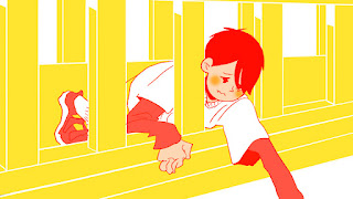
To bring this into my character I did some tests with a character sketch I did quickly. Rather than lining it as it is I outlined the character with block colours to create silhouettes. I could also look into just using one colour for the flash backs which means I have to figure out how to use negative space- that could be very interest as well. The blue example might be the closest example of it. Using just neon blue for the whole film, with the main character wearing a yellow jumper maybe so the character can stand out of the background even more.
While I was working out how the character might look I did a possible mock up of a shot from the flashback scene. The drawing is a little further away than I want it but it gives me a chance of drawing the bridge as a whole. Here are some test designs I did:
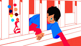
This was one of the first tests I did, I actually really like the way it incorporates screentones. But would it get distracting when animated on? Would the blue and red also seems a little too strong for a flashback? This was my first test, so I continued tweaking the colour palette a bit.


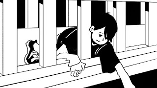
I just tried the black and white look of of spite, I feel like it's a little bland. I wanted the flashback to have a nostalgic vibe to it so I wanted to use colours that you can find in children toys/ gives off Chungking Express vibes to it.
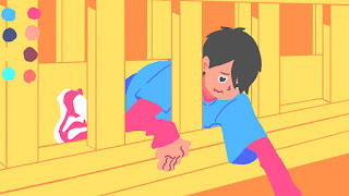
The last two tests I drew the characters without an outline. I actually like the look of it but the background suddenly had too much detail. So I went on to simplify the background even further with this:

To give the overall look a bit more texture I put on a noise filter so it looks like something from an old cartoon. I'm still a little skeptical on the colours and the look so I might continue tweaking it. It seems quite difficult and extravagant to animate so I'm going to test it out a bit more and see where I can simplify it.


